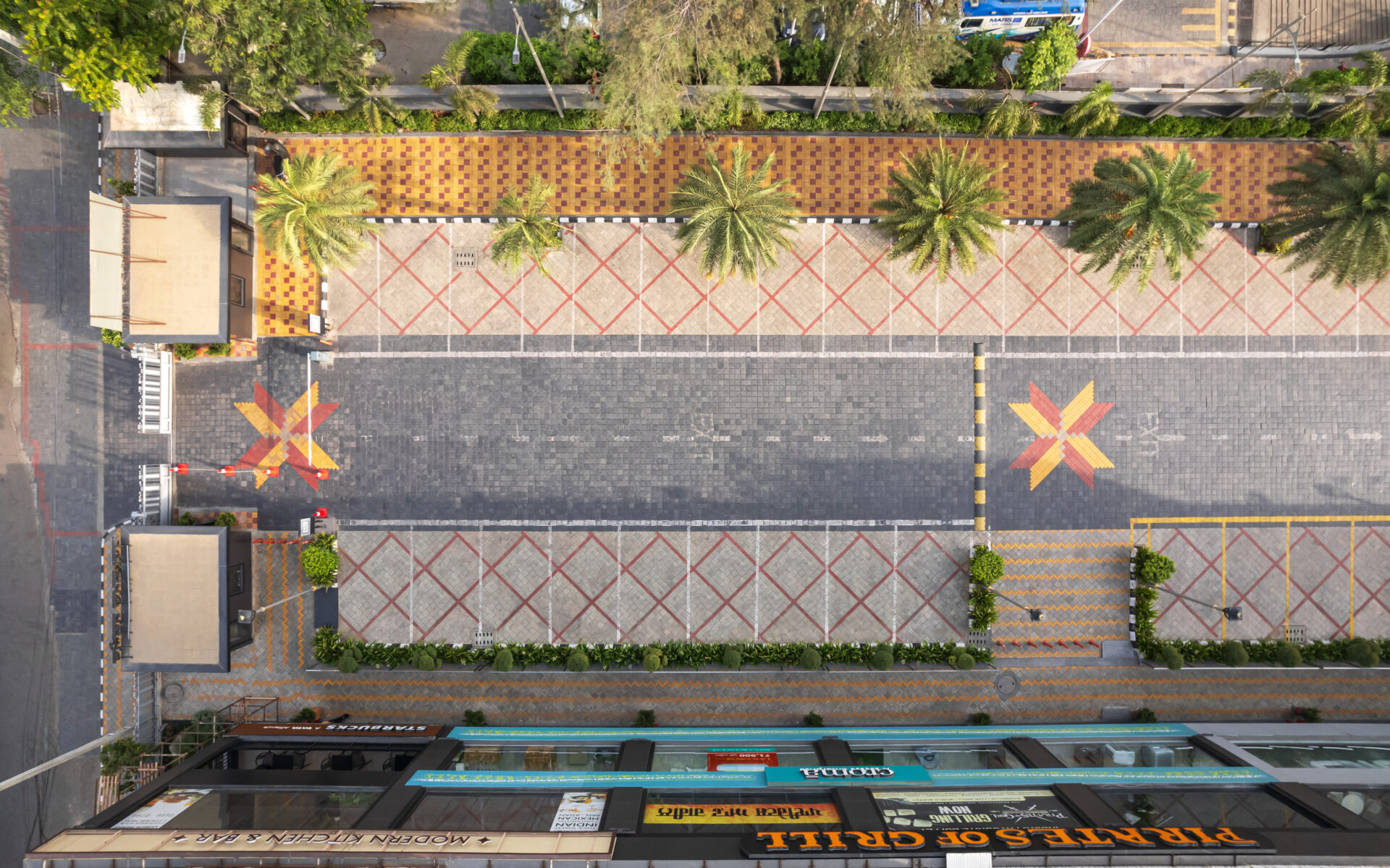
When the design team joined the Raj Kamal Market project, the facade had already been solidified, and the project’s stakeholders, including the brands moving into the space, had accepted the building as it was. While many architects would see this as a limitation, we viewed it as an opportunity to address other critical aspects of the building’s form and surroundings.
The first challenge was to reimagine the building’s boundaries. Instead of resorting to a typical solid wall, we introduced a semi-partitioned boundary. This decision was key in creating a seamless connection between the inside and outside, allowing passersby to engage with the market visually before entering. This subtle shift gave the project, Raj Kamal Market a more welcoming, open character.
We as the design team also focused on the movement of people and vehicles at the ground level. Observing from the terrace, we identified three distinct types of movement: cars, two-wheelers, and pedestrians. A unique floor pattern was devised for each area, enhancing both functionality and aesthetics. The zigzag pedestrian path encouraged leisurely walks, while the semi-geometric design for two-wheelers reflected the fast pace of that zone. Additionally we also used colours to define the movement areas, unifying the different sections with a vibrant yet practical solution.

